


|
|
This paper describes the design process behind the contact card user interface in Claris Organizer 2.0. This was a situation where traditional UI elements were insufficient to satisfy the design's requirements. High-fidelity prototypes were developed, iterated and tested against competing designs. Standards and guidelines had to be broken to achieve the design's objectives. Despite having more fields and more functionality, the resulting design was smaller, faster, and preferred by users.
contact card, expanding sections, dense input area, PIMs
As designers, sometimes we're cornered by the requirements of a design problem. Standard UI widgets are inappropriate or insufficient, and we're forced to invent a new interaction element to satisfy the design's requirements. This paper describes such a design, the expanding sections of the contact card in Claris Organizer version 2.0. Organizer is a mass market software product for Macintosh computers in a category called Personal Information Managers (PIM). The software helps users keep track of contacts, schedules, and to-do's.
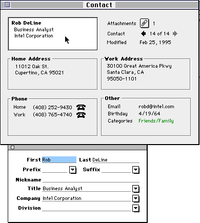
The contact card is the interface where the user enters, edits and views information for a single person in the contact database. The contact card is one of the most heavily used interfaces in the product, which accounts for the intense effort to refine it.
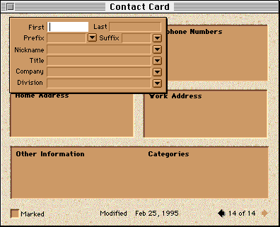
The starting point of the design is the contact card from the previous version of Claris Organizer. The window is a traditional Macintosh design with standard text fields and pop-up controls.
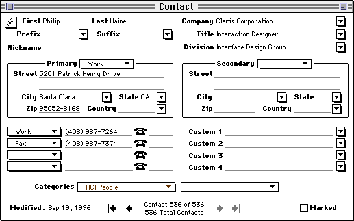
The design was satisfactory for version 1.0, but new requirements challenged its viability in the second version.
We knew from early mock-ups that we could not blindly add all the new fields and controls to the window. The window would occupy too much of the user's screen real estate, and the barrage of over eighty fields and controls would be overwhelming. We wanted to avoid the bloatware trap that so much software falls into today. Nevertheless, this served as our baseline design since users would understand it immediately and find it no worse than other software.
Our competitors in the PIM market segment faced exactly the same dilemma and they attacked the problem in various manners. Here's a picture of the contact card in NOW Contact version 3.6.
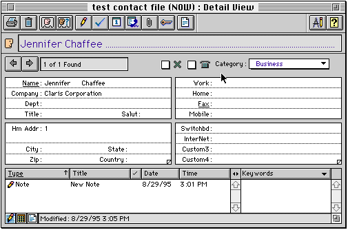
The two sections in the middle have triangular dog ears to page through addresses and custom fields. We found this solution unsatisfactory because it concealed the user's information. The user must click on the dog ear to see what other information is available. This design also did not meet our aesthetic standards.
Whenever a challenging design problem is encountered, we find it beneficial to state prioritized design criteria in writing. Design criteria serve as a scorecard against which design proposals are rated. They state both what's important and what's unimportant in the design, which helps to focus and break down the complex problem.
As design avenues are explored, the criteria tend to evolve as consensus is built and as we gain clarity of what is important in the design and what is not. Here are the design criteria that evolved for the contact card, categorized by importance.
The contact card problem can be thought of as an instance of a general challenge faced by the software industry: how can a product be made more powerful from one version to the next while maintaining or increasing simplicity?
The contact card problem at first looks like a common form design problem. But we know that if the problem is simply treated as such we cannot satisfy the design's requirements. By looking deeper into the problem space, characteristics emerge which distinguish it from the general case of forms design. The redesign of the contact card hinged on three such insights.
Even though people asked for more and more fields, it turns out that very few contact cards in a user's database are totally filled out. Most have just one phone number, many have only one address filled in, and so on. All the fields are needed across the entire contact database, but rarely are all fields needed for a single contact. This observation was made of our own data files and verified against data files of a handful of power users.
Based on this we wondered if it would be viable to make a window that was significantly more compact for 95% of the contact records and to grow it only as much as needed for the 5% that demand it.
When users first acquire a PIM, they spend a lot of time entering all the people in their address books. After a certain period of time, look-ups become more common and data entry is becomes less intense.
Based on this, we wondered if it might be reasonable to bias the design toward readability, deliberately incurring a small cost in data entry and editing. More concretely, the idea was to conceal the weighty controls and display a clean, easy-to-read window in the case of looking up contact information.
By looking at any business card, one can see that it is not necessary for each field to be labelled for the meaning of the field to be clear. The company name, title, and address information are instantly recognizable by context and convention.
This observation suggested that we might be able to conserve space and reduce clutter further by removing not just the controls around the fields but their labels as well.
Taken together, the observations inspired a design concept of a contact card with some sort of loose modality. In its rest state, the information would be optimized for readability, resembling a business card. The contact card would not be large enough to handle the worst case, but rather big enough for the 95% case. It would grow as needed for the minority of contacts with more information.
To edit the data you would touch the area you wanted to affect to reveal the necessary controls. Rather than switching the entire contact card to a distinct editing mode, there would be five or six sections which would come alive for editing. Heavy users could efficiently navigate between sections with the keyboard.
The concept was initially pitched to the team in this verbal manner. It got little support. The team members felt that it sounded good in theory, but in practice they imagined a clumsy interface with windows continually popping up in the users face, the user getting stuck in "modes" (a dirty word) and that it would require extra effort to learn and use.
The team's concerns were legitimate. There was no apparent precedent against which to evaluate the idea and it sounded potentially awkward and busy. The proposal hinged on tight real-time interaction between the user and the machine and in such cases the devil is in the details. Too much delay, flicker or motion could make the design more annoying than helpful. Introducing new interaction elements tends to come with a learnability hit. In such cases, high-fidelity prototypes are appropriate.
Medium-fidelity prototypes were developed to incarnate and refine the idea. Due to space limitations only major variants in the design are presented here.
In the first three iterations of the design, the contact information is grouped into sections in a small, clean window. Clicking in a section opens up an expanded version adjacent to the window with fields and controls for editing the information. Pressing the Tab key walked through the fields, and tabbing off the last field opened up the next section.
This first attempt validated the team's predictions. It was disconcerting to have the sections pop up all around the window and annoying to follow the movement with the eye.
This design was unworkable because it required that significant window space be reserved all around the contact card for the expanded sections to appear. With these margins taken into account the design was effectively larger than the starting point design.
In the fifth iteration the expanded section always appeared in the top-right corner of the contact card, covering less important information such as the modification date. The idea was to give a predictable place for the expanded section to appear, and cut down on the margin needed around the contact card.
When the author showed this to the first person available, there was a strong, immediate reaction that information was being concealed by the expanded section. The strength of this concern had not been anticipated.
The prototype was quickly revised to attempt having the section always appear below the contact card.
This attempt seemed even worse. Entering information with a keyboard felt unnatural because of the dissociation with the expanded section and the compact version. Tabbing between sections lacked the strong spatial component of the baseline design.
The eighth iteration took a different tack. Clicking on any compact section opened up a single pane adjacent to the contact card with all the fields and controls in a scrolling pane. The pane scrolled to the correct section and field that the user clicked on. The idea here was that keyboard entry would be more fluid since the eye could remain in the scrolling pane as the user tabbed through the fields
Once again this didn't quite make it. It still felt klunky and unnatural clicking in one place then having to move elsewhere for the next step.
Incidentally, it should be noted that many of these iterations existed for less than half an hour before the problems became clear and new ideas surfaced.
The previous prototypes made it clear that forcing the user's eye move to a different place to do the editing was not going to work. The next idea was to explore making the section open in place rather than in an associated pane.
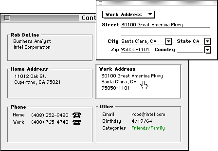
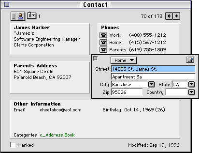
In the tenth iteration, as you click in a section the contact card grows and the other sections move out of the way while the one that was clicked expands to reveal the labels and controls.
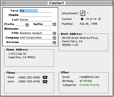
This turned out to be the first plausible design. Clicking in a section to open it up felt natural and the flow was smooth. No information is ever covered up, and the eye does not have to follow the software to a different part of the screen. From a visual design standpoint, it looked like you were opening up the section, peeling away the grey skin to see the innards.
Until this point, it was only necessary to program the prototypes to an intermediate level of fidelity. The prototypes allowed us to tab through the fields and click into the sections, but not enter or edit data. Since the broad approach now seemed to be workable, time was invested working details into the prototype. This was also the first design that was exposed to the development team.
Unfortunately, the team members were still not sold on the design. They reacted to the awkwardness of the contact card growing as a whole, the distracting motion of the neighboring sections, and the large gap that was created when one section was opened and others shuffled out of the way.
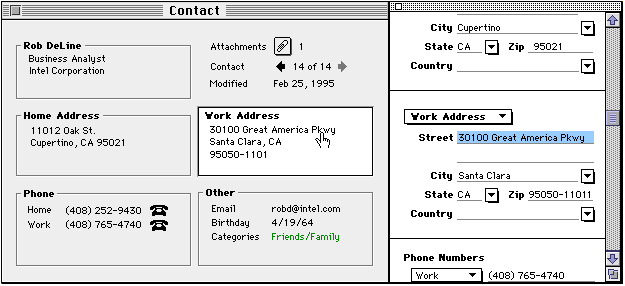
To overcome the "motion sickness", the next idea was to have the expanded sections appear over the contact card rather than inlaid into it, to give the effect of the section popping forward and coming to life. The contact card didn't grow and the sections no longer had to shift around. Care was taken not to let the expanded version overlap any of the user's data; only the unimportant labels in adjacent sections were covered up by sections.
This version also had the following refinements:
By this point, all the substantial issues raised by the team had been addressed, and the design got partial support from the team. Other team members still believed that the sections coming and going would be annoying and slow, that it would be harder to learn than the baseline design of a regular flat form. To allay these concerns, another team member came up with an alternate design, the self-labelling contact card.
The new idea was to keep all the fields and controls visible at once so that the user could fully access all controls without expanded sections coming and going. Space would be saved by putting the labels of the fields inside the fields themselves. As the user types into the fields, the labels get replaced with the data. To reduce clutter and enhance readability over the baseline design, the labels in blank fields would disappear when the contact card was not being edited.
This design was larger than the expanding section design, but still smaller than the baseline.
Until this point, only "friends and family" usability testing had been necessary to advance the design. Now that it had matured into something plausible, it was worthwhile testing it in the lab. The first lab test pitted the expanding section design against the self-labelling designs.
Before doing any study, we like to try and predict what will happen in the lab. It's very educational, because your assumptions are challenged directly: you're either right, or you made some assumptions that you were previously unaware of. Putting oneself in the position of a neophyte and running through the tasks highlights some obvious issues that can be fixed before the test is run.
Ten users with varying degrees of experience with computers, the Macintosh and PIMs were exposed to both contact cards in the usability test. Half used the expanding design first; the other half used the self-labelling design.
The study suggested some refinements that could be made to the expanding section design but uncovered no fatal flaws.
The usability test eliminated the self-labelling approach from contention and made the entire team feel more confident moving forward with the expanding section design.
Only detailed refinements were made to the expanding section design based on the test:
Some lingering worries did remain however: namely that because of the overhead of opening and closing sections, the expanding contact card would be slower to enter and edit information than the baseline, and that over time the interface may become tiresome. In other words, we may have made it slicker, but done harm in the process. We could test the former concern in the lab.
At this point the prototypes reached their limit of usefulness; they were slow and limited in functionality as compared to how the actual product would behave. The next test
Since this was a risky design, we conducted another usability test several months later when the actual code was stable enough. The purpose was to validate some details of the design, to do an overall reality check of the reasonableness of what we were going to ship, and to test the hypothesis that this design was slower to operate than the original "flat" design in the previous version.
Ten users from various backgrounds and experience levels used the contact card in the course of a broader usability test. A time-trial test was appended to the study for subjects that had finished all previous tasks. It involved entering four actual business cards into each contact card of Claris Organizer versions 1.0 and 2.0. Half began with 1.0's contact card and the rest began with the expanding section design.
We were pleasantly surprised by the unexpected increase in performance with the new design. It appears that the chunking of information into sections may have helped users zero in on the fields they needed. The baseline design had forced the user to visually scan dozens of fields.
At this point the whole team was in support of the approach. The last remaining question was how it held up to long-term usage.
As of this writing, Claris Organizer has been available in the marketplace for several months. The feedback from users been positive on the product as a whole and it has received favorable press reviews. No serious issues have been heard regarding the contact card either from the field or from users internal to Claris. For a commercial product, this is the acid test; with thousands of users it's difficult to make any change without offending part of the user base.
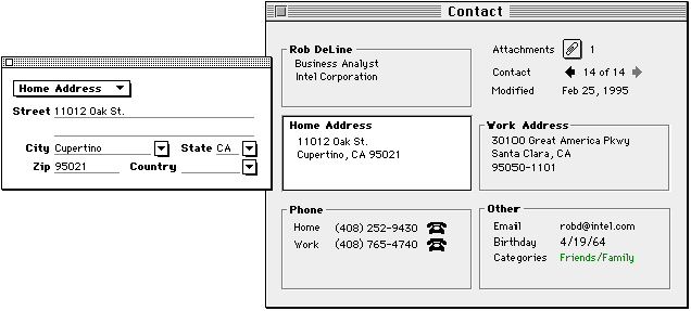
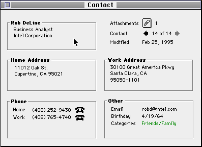
Here is a screen shot of the actual shipping design in Claris Organizer 2.0:
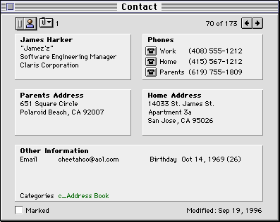
The expanding sections design compares favorably to the objectives set out from the start. The new design is no less learnable or usable, lets the user see all the data at once, consumes less space on screen, and is potentially faster to operate.
|
|
|
|
Change |
|
Number of fields |
|
|
31% more fields |
|
Number of controls |
|
|
27% more controls |
|
Height x Width (pixels) |
|
|
16% smaller |
|
New features |
|
|
6 new features |
|
Average speed of entering business cards |
|
|
16% faster? |
|
Satisfaction |
|
|
Higher satisfaction |
Here are some thoughts on the design process that are illustrated in this case study.
Keeping prioritized criteria in writing provides several benefits to the design process. Among other things:
One of the most frequently used methods we use to simplify the problem space is to weigh a design issue by frequency. How many users experience the issue? How often? What confluence of factors has to occur for the issue to actually surface?
In the case of the contact card design, the four key "common sense" observations that lead to a simple design were all born out of this analysis approach.
To achieve the design goals it was necessary to create a new interaction element, the expanding section. It's usually dangerous trying to do better than the tried-and-true GUI elements - there's often a hit to learnability or usability. Several products on the market today suffer because they break the rules without compensating for what's lost. Here are some of the details of the contact card design which were added to compensate for introducing an unfamiliar interaction:
|
Issue |
How it was compensated for in the design |
|
It may not be obvious that sections need to be opened to edit. |
Creating a new contact automatically opens the first section to introducing the concept. The raised 3D look of closed sections invites clicking. |
|
It may not be obvious how to close the open sections. |
Close corner included in expanding section. Other predictable keyboard and mouse ops also work, namely clicking outside the section and using the Enter key to commit the changes. |
|
The sections may overlap the user's data, hiding information and reducing access to them. |
Expanding sections were spaced, sized and placed so as not to overlap any information. |
|
Clicking to open sections will be more cumbersome than tabbing between fields. |
Tabbing automatically opens subsequent sections. Extra keyboard shortcuts were added for jumping between sections, for users who needed the efficiency |
|
The compact window would not be big enough for fully filled out contact records. |
Space in the closed Other Information section is reused depending on the information that's actually present. The contact card grows as a last resort. |
|
It would be slower to edit a piece of information since you must first open the section, then make the text selection. |
The user can click directly on any field in the collapsed state to both open the section and directly select the text. |
|
The motion of sections opening and closing will be busy or klunky. |
The feature was engineered carefully to be fast and efficient. |
The amount of prototyping, testing and iteration this feature got was well above average in industry, even for a company like Claris whose tag line is "Simply Powerful Software" and which invests in a strong interface design group. The contact card deserved it because it was a difficult, risky and expensive design as being one of the central features in the product. With commercial software it's simply not practical to expend this much effort on most problems.
A demo of Claris Organizer 2.0 is available for download at www.claris.com. The author wecomes all critical feedback of the design from users and the CHI community.
The contact card was created in a near-ideal industry environment for interaction design. Special thanks go to James Harker and Seth Odam, members of a new generation of software engineers who "get it", the researchers who conducted the usability tests: Shannon Halgren, Tracy Halgren and Elissa Smilowitz, and the visual designer, Jennifer Chaffee.
D. Philip Haine 12/15/96 |
|