


|
|
There are many challenges to delivering a state-of-the-art user interface in a startup company, especially when the Product Manager is also the User Interface Designer. This design briefing describes the process of making incremental improvements to an existing product, given very limited time and resources, while also designing a new replacement product. Several well-known design techniques and strategies were used, and the relative success or failure of each approach is discussed. In addition, the design rationale for and evolution of the successful new user interface are presented.
User Interface Design, User-Centered Design, Design Process, Iterative Design, Paper Prototyping, World-Wide Web, Web Measurement, Startup Company.
The experience of designing user interfaces at a small startup company is quite different in many respects from the interface design work done in large companies. While the startup environment can help facilitate communication within and across teams, as well as enable faster decision-making, there are many difficulties either not present in larger companies, or present to a much smaller degree. Among those I experienced were:
Despite these challenges, this design briefing shows that it is possible to create a state-of-the-art interface in a very short timeframe with just one person to drive the effort.
In March of 1996, when I joined Internet Profiles Corporation (I/PRO), this startup had approximately 70 employees and a small set of services. Its clients included nearly all of the top twenty World Wide Web sites. I/PRO provided monthly audited reports on site usage, in addition to a web-based service called I/COUNT that allowed users to create basic reports of their own. Clients were experiencing many usability problems with I/COUNT, and salespeople were complaining that it was difficult to demonstrate to potential customers.
I/COUNT was designed for use on the web. It consisted of a combination of Hypertext Markup Language (HTML) and Common Gateway Interface (CGI) scripts that dynamically generated pages for the user as he or she navigated through the product. I/COUNT 2.0 was implemented using a new HTML feature called "frames," which divide the HTML page into sections. Unfortunately, the use of frames was not implemented well and caused users much confusion.
We had to define what our long-term strategy should be for a web measurement reporting tool. This project was code-named I/Design, a client-server application designed to leverage the existing I/COUNT back end to deliver standard reports. In the second phase of development, I/Design will replace I/COUNT as the front-end to our web measurement tool, as we add the custom-reporting functionality.
This paper describes the usability improvements that were made to I/COUNT, and the user-centered design process which led to the I/Design user interface. Also discussed are the techniques usedan "expert" evaluation of the existing interface, on-site interviews, focus groups, rapid iteration of paper prototypes, and hiring an external graphic design firmas well as a critical evaluation of their effectiveness. The new I/Design interface is easy to use, graphically appealing, and a pleasure to demonstrate. This product, currently in alpha, now seen as key to the company's success.
Within two weeks of starting the project, I wrote and distributed a strategy document that described a phased approach to improving the company's user interfaces. The document described why good interfaces are valuable, and described various design methodologies and the people and time necessary for each. Finally, the document described a phased approach to creating good user interfaces at the company, including immediate, short-term, and long-term recommendations.
This document educated the entire company, helped upper management understand the resources needed to implement the recommended methodologies, and set concrete, phased goals for improvement of the interfaces. It was a useful tool for gaining buy-in and mutual understanding.
The document outlined the following plan. In the immediate term (one week) I would review the existing I/COUNT user interface, listing problems I thought users would have, recommending solutions, and prioritizing the problems according to a combination of the importance of fixing the problem and the viability of doing so immediately. In the short term (about 1.5 months), I would conduct on-site interviews and organize focus groups to understand users' needs. Long term goals included replacement of the current interface with a more sophisticated one.
A reasonable approach to find many usability problems in the existing product in the immediate term was to go through the interface myself, reviewing it for design change recommendations. I called this "expert review." At the time I began this effort, I/COUNT was in beta for the 2.0 release. During the time in which I was conducting this review, release 2.0 went into production, and the user interface changes were to be made in a follow-on maintenance release a few weeks later.
Before starting the review, I received a forwarded email from a beta customer who had some comments on the design. Desiring to be unbiased, I put the email aside without reading the customer's comments, performed my own evaluation, then compared my results to her comments. Of her eight comments, I had identified seven. This provided a welcome sanity check.
As I explored the user interface, I documented my findings in a table, a portion of which is shown in Table 1. Each row had an entry in the problem and priority columns, as well as at least one of the solution columns.
After completing this process, I conferred with the development manager about making some of the changes. Development resources for this product were scarce: only one developer was available to work on it for a few days at most. In addition, he was not familiar with the code.
We went over the table, which was expanded to include feedback
from on-site interviews. Eliminating all eleven low-priority items
from consideration, we discussed the feasibility and time estimates
for implementing solutions to the remaining problems. Thus, based
on a combination of importance and ease of implementation, the
list was pared down to six of the twelve high-priority items and
four of the nine medium-priority items. I requested these ten
changes formally in an email, listing the high- and medium-priority
problems and their associated fixes, also stating the rationale
behind the decision to concentrate on these items: "Given
the emphasis on saving engineering and designer cycles for the
real upcoming interface redesign, we decided not to list anything
that would definitely take too long to implement, involve significant
layout changes, or was a low priority change."
i | Within a Few Days | |||
| Frames are too slow. When a user clicks on a frame and it takes minutes for the results frame to update, the user thinks nothing has happened and keeps clicking in that frame. Also, the layout of the frames is cumbersome, shows information many don't need, and takes up too much real estate. | H | Default to no use of frames. | Make non-frame interface as easy to navigate as possible.
If necessary, design an alternative frame interface, in particular 2 side-by-side frames, or navigational frames at the bottom of the screen (as on Netscape's home page frame demo). | If alternative frame design for this release is not feasible, put this at the top of the post-release to-do list. |
Unfortunately, when I reviewed the changes made, I found that only the items listed as high-priority had been fixed, even though some medium-priority items were included in favor of higher-priority ones because they were easier to implement. It was probably a mistake to separate the list of ten items into the headings of high- and medium-priority. Nevertheless, the mandate was to go production immediately without spending more resources on it.
One of the biggest problems noticed, both in my own "expert review" and in speaking with a 2.0 Beta user, was the use of frames, as described in the sample problem described in Table 1. When using the I/COUNT system through their web browser, the user would sign-on at the I/COUNT web page and then be presented with the screen shown in Figure 1, which illustrates the cumbersome use of frames in this product. The top frame shows the area of the system the user is in (the Main Menu, with links to the Report Queue and Custom Report areas); the lower left frame shows the list of reports one can run; the lower right frame displays help.
Users discovered that they had to scroll many times, whether looking at the lists of reports in the Main Menu or the Report Queue, or filling in the fields for their custom report. Also, they felt that valuable screen real estate was being wasted by displaying extraneous help in the lower right frame. Finally, the frames were painfully slow to load. There was a way to use the interface without frames, by checking a box labeled "No Frames" at the bottom of the sign-on screen. A few users regularly checked this box when signing on, but others either did not notice this option or struggled with the frames because they felt that if it were the default choice, they were supposed to use it.
The quick solution was to default to non-frames mode. The sign-on screen "No Frames" checkbox was changed to a radio button asking the user for their preference of interface style, the choices being "No Frames" or "Frames." The former was selected by default, and signing on with this choice results in the screen shown in Figure 2. In the screen size shown, users could now see eight reports with each scroll, as opposed to four in the previous version. The help page was only displayed if the user clicked on the Help button.
If users scrolled down in the top frame of the main menu they would see a command bar, where several commands were disabled, and only Help was active. These commands were always disabled, causing confusion for the user. Similarly, the "describe" command on the command bar under each report was always disabled, as shown in Figure 1. Such non-functional commands were removed in the next version, as illustrated in Figure 2.
Another difference between the screens in Figure 1 and
Figure 2 is the removal of the repetitious "Run"
icon. In addition to making the system run faster due to the removal
of this graphic, the interface became a little more consistent,
with all actions you could take on a report listed in the command
bar beneath the report. The change also improved the frame-based
interface in that it allowed more use of horizontal space for
the report name. The Report Queue (not shown) underwent a similar
change, where the View icon was rolled into a the command bar.


The fact that some of the easy-to-implement but "medium-priority"
changes were not made, even after negotiation, was very frustrating.
But there were many other problems that could not be addressed
in the extremely short timeframe of this follow-on release. For
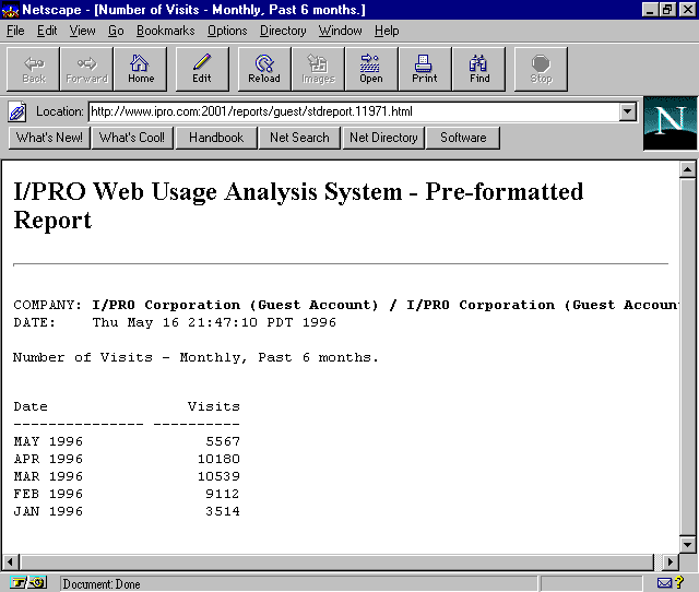
example, the report output, produced in HTML, was extremely crude
and difficult to understand (Figure 3). Only single-column
reports could be generated, and it was possible to create reports
that generated meaningless output.
The expert review was a time-effective way to find usability problems in the current product, as it helped quickly identify problems and outline possible solutions. Yet given the lack of engineering resources available to fix these problems, much of the effort in identifying problems and solutions was wasted; only a few of the most simplistic changes made it into the new version. However, if resources become available for further improving the interface, at least the problems and recommendations for fixes are ready.
The next task was to design the user interface for the product that would eventually replace I/COUNT.
To better understand the target audience, we began with on-site interviews. Nine customer sites were visited, six in New York and three in the San Francisco Bay Area. The interviews themselves took approximately six days. In total, it took about two weeks of work to complete this research, which was completed by mid-April.
The interview was created prior to visiting the sites. It covered six pages, including blank space for writing answers. Each interview lasted one to two hours. The topics covered included:
The time spent on this topic was valuable. It helped me understand who our target audience was, what their concerns were, what their level of technical expertise was, even what their surroundings were like. I could clearly picture the customer who would be using our system when defining and designing I/Design.
I arranged two sets of focus groups, working with an external company. Though this strategy incurs extra cost, it saved valuable time. In addition, as professional coordinators they were able to help us create clear definitions of our objectives, manage the amount of content to be presented, recruit participants matching our target profile, and gracefully conduct the group itself.
The first focus group, held in San Francisco in late May, consisted of people who were not our customers but fit our target customer profile. Topics covered included exploring their motivation for web site usage analysis, exploring their response to a summary description of our intended product offering, and getting their reaction to a sample user interface design. Though we obtained useful insights from the exploration of their needs, the product description had been boiled down so much that participants didn't understand it. Also, they found the two sample interface prototype sheets somewhat unclear, since the interface was not presented in full and the paradigm was better understood by interacting with it.
Taking these lessons into consideration, we held a second focus group in New York in early July. This time, there were two groups: customers, and non-customers. Also, we skipped the evaluation of the interface design, but did present sketches of possible reports. Again, we gained useful insight into the minds of our target audience. We also learned about their preferences regarding the offering of reports, i.e. 3-D reports were unnecessarily confusing, and some reports were popular while others were not.
Focus groups were a useful way to learn about potential customers. It was useful to contrast the comments made by them to those made by our current clients. Also, current clients said some things in the presence of a third-party facilitator that they might not have otherwise expressed to us directly. However, given a choice, I would pick the on-site interview method as the more effective, more economical method of understanding clients.
Between mid-May and mid-June, the Product Plan was revised several times. This document included a statement of product purpose and audience (the audience being web advertising managers and site content providers), constraints of the problem space, decisions made about what the product would be and how it would be developed, and a functional specification.
This document was an invaluable tool as work on the new product progressed. As new people joined the team, they received this document, which described what the new product would be and the rationale behind the decisions made. To summarize, I/Design would be a new product that would eventually replace I/COUNT. It would be a client-server application, leveraging existing I/COUNT back-end functionality. It would be developed in C++, delivered on Windows and Macintosh, distributed to users via the web, and released in three phases.
The first phase would deliver a set of standard reports to the client and allow him or her to perform a certain set of actions on these reports, such as viewing, printing, saving, and emailing. The second phase would enable users to create their own custom reports, and would at this stage replace the I/COUNT interface. Though custom reporting was highly desirable in Phase I, it would have significantly impacted our "time to market" requirement. The third phase would deliver advanced reports and functionality.
The Phase I release addressed two major problems. First, by shifting to a push-mechanism, we could optimize the system for these standard reports and better predict system loads. Second, not only was the user interface for I/COUNT difficult for clients to use and causing increased demand on support, but it was difficult to demonstrate and was therefore more difficult to sell. I/PRO needed to demonstrate an ability to deliver state-of-the-art, easy-to-use interfaces while delivering reports in a timely manner.
I began by sketching designs of what the interface and resulting reports might look like. I had several design objectives in mind, and considered other design paradigms than the traditional graphical user interface (GUI). In particular, I wanted the interface to work on both Windows and Macintosh; be easy to navigate; show reports in a "print preview" style yet enable users to zoom in to read the text if desired; allow users to print, email, save, or delete reports easily; and be easily extensible for additional features in future phases.
Initial sketches included functionality of Phase II, in particular the ability to create custom reports via wizards, view the queue graphically, and access the list of completed reports, viewing each report as desired. However, as this design has not yet been released, I will focus here on the design of Phase I.
I created a paper prototype, testing it on subjects using methods learned in a Jared M. Spool seminar. Individual screens were represented on paper, dialog boxes and pull-down menus were cut-out pieces of paper overlaid on the main screen, and a transparency laid over the interface allowed users to fill in fields and click on interface elements. In the beginning of each session, I gave users a transparency pen and explained that it was both their mouse and their keyboard. Test subjects quickly picked up on the concept, and performed the required tasks as I played the computer, responding to their actions by displaying the appropriate result using the paper prototype.
As each subject went through the test, I took notes on what worked and what didn't. Sometimes when the user had a problem using the interface, I would sketch out an alternative design right there to see if I could find an alternate solution that worked. Before testing the prototype on the next subject, I implemented the changes that I felt would increase usability. Subjects were very good about criticizing the design and making suggestions.
Both I/PRO employees and clients served as subjects. At the beginning of the process, I estimated I would need eight to ten subjects in order to iterate the prototype to the point where it converged on a usable design. Though initially worried that clients would not want to volunteer their time to be subjects, I found that they were more than willing to participate and were glad to be included in the process. The response rate to an internal call for participation was outstanding, and I had to select people based on getting a good cross-section of the company, from a marketing person, to a developer, to the CEO. In the end, I had tested the prototype on three external clients and eight internal people, for a total of eleven subjectsall in one week at the beginning of June.
This turned out to be a highly effective, efficient way to design the user interface. In the first few tests, the overall feeling was lukewarm, with users experiencing some confusion. By the final tests, though the overall paradigm did not change significantly, users had minimal problems using the interface, and their comments were positive: "Cool," "It's way too simple," and "Well done."
I made a photocopy of the paper prototype, illustrating a path through it that touched on every aspect of the user interface. A sample page appears in Figure 4. I gave the resulting packet to the engineers, along with a walkthrough so they understood it, so that they could start coding the user interface portion of the product.
At the same time the interface was being designed, we were looking for an external graphic designer to contract work on the project. Henry Dreyfuss Associates, a well-known design firm in New York, was selected. The initial one-day meeting with the project director was at the end of June.
First, we went over the paper prototype scenario packetthe same one that had been given to the engineers. Next, she attended our I/Design team meeting, where she explained the graphic design process. This helped everyone understand what to expect over the coming months. She and I also went over adjectives that would describe the feeling of the finished product; we wanted a feeling of strength and stability without being too stuffy. It was in this meeting that we came upon the marble theme seen in the designs (see Figure 5).

When the initial graphic designs were delivered, the team chose a combination of different treatments. This general design was iterated a few times. Then, once the overall look was established, they proceeded to design the remaining screens. The engineers rolled in the graphic design as each piece was delivered.
Meanwhile, the designer began the graphic design of the standard reports. The initial set of treatments looked too much like our audit report, which I had provided as a sample of what I/PRO currently delivered. I wanted the I/Design reports to be more graphical, colorful, and in harmony with the rest of the user interface; we needed to make it more visually appealing. The resulting treatments were much more attractive, and we selected one of several looks. In driving the look of the reports, I had to consider how they would be used. So I printed them out in color and in gray-scale, photocopied them, and even faxed them from one fax machine to another in our company.
Later in the process, details were rolled into the graphic design. The real product name replaced the placeholder name, the splashscreen designs were delivered, and the application icons were completed. Minor changes were occasionally requested and delivered.
Figure 5 through Figure 9 illustrate the I/Design user interface design and graphic design.
After logging in, the user sees the screen shown in Figure 5, which corresponds to the paper prototype screen shown in Figure 4. By default, the user is placed in the Standard Reports area, as seen by the selected tab on the left-hand side. The standard reports that this client site has elected to buy are listed in the middle area. One of these reports is always selected (the first one by default), and the selected report is displayed in a "print preview" fashion on the right-hand area of the screen.
Some reports are delivered daily, others are weekly reports, and still others are monthly. The list shown always shows the latest version of each report. Users can access previous issues of a report by clicking on the Back Issues button. For example, if one selected a daily report and clicked Back Issues, one would see the previous 30 issues of that report listed in the middle area, the first one selected and displayed to the right.
There are multiple ways to perform navigational actions; for example, one can view the next report by pointing and clicking on it, by hitting the down-arrow key, or by clicking on the Next Report icon beneath the report display. Users can zoom in on a report to read it better by clicking on the Zoom-In icon, which causes the report to widen to take up all the space to the right of the left-most section; the report can then be scrolled using a scrollbar, and zoomed back out with the Zoom-Out icon.
A common complaint in the I/COUNT system was that users didn't know the status of their account. This resulted in many calls to account managers, asking why a particular report was not ready. In an effort to cut down on such calls and to provide users an easy way to visualize various areas of the system, an account status screen was created (see Figure 6). At the top is a rolling banner that gives brief updates if necessary, such as a message stating that yesterday's data has not yet been successfully loaded. Also, users can see how many reports are saved for shared use on the I/PRO server (each site gets a certain amount of space) and how many have been saved locally on the user's machine. If the user at any point requires help, he or she may click on the help button, and context-sensitive help appears in their default browser.
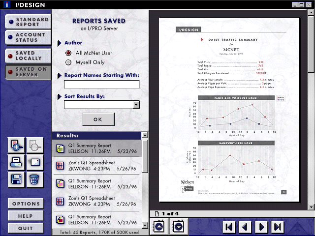
The Local Reports and Shared Reports tabs allow users to view reports that have been saved, either on the local machine or on the I/PRO database. Clicking Local Reports brings up a standard File Open dialog, defaulting to the folder where I/PRO reports are saved. Clicking on Shared reports brings up the screen shown in Figure 7. Users can filter the list of saved reports, and select a report using the navigation methods described above. Again, the first report is selected and displayed by default.
Users may print, email, save, and delete reports using the icons in the left-hand area (below the zooming icons). Printing brings up a standard print dialog. Similarly, deleting a selected report brings up a small confirmation dialog. Emailing and saving a report are accomplished using the middle section of the interface, the report content remaining visible on the right-hand side. Figure 8 illustrates the email option.
Finally, Figure 9 shows the look and feel of a standard report. Note that the report was designed to look good in grayscale, and was tested for good copying and faxing.
Although people find the design easy to use, there were a number of problems presented by this design paradigm, primarily concerning spatial constraints. First, the tabs along the left side allowed minimal space for describing the four main areas of the interface. The last two tabs were renamed several times, flipping between options like "Saved Locally" and "Local Reports." The final design included the latter, along with "Shared Reports" to get to the reports saved on the I/PRO server. However, this is a misnomer, because one can use the Local Reports interface to save reports to a Local Area Network (LAN), in which case the reports are shared. Also, the limited space in the middle section meant that standard report titles listed there had to be shortened. Finally, the extension to custom reports will use the middle section for the report wizard screens, showing the results being built up in the right-hand window; space will likely be an issue here as well.
Within six months, I/PRO delivered an alpha release of an entirely new interface for the product. The startup environment certainly aided the speed of this delivery by bringing down some of the barriers of hierarchy, communication, and decision-making evident in larger companies. However, the startup situation also dictated a small budget and urgent time constraints. Similar constraints are faced by employees in any company, which is why I believe the lessons learned here can be applied in many situations.
The following strategies and factors worked in favor of developing a good product quickly. First, the on-site interviews were key to understanding customers and their needs early on in the process, and were well-worth the time and money spent. Also, doing rapid iteration of a paper prototype on internal and external subjects led to a user interface design that, in the end, was easy to use. Hiring an external graphic design firm was essential to creating a professional, attractive look for the product. Another factor that worked in my favor was my being co-located with the engineers; they were cognizant of all the work that went into the design, and could easily ask questions of me when necessary.
Not all strategies were that successful. The expert review of the I/COUNT system produced fast recommendations, but some of that time would have been better spent ensuring they were implemented. The focus groups were not an optimally efficient use of time and money; the on-site interviews gave us nearly as much "user needs" research information, and the paper prototype testing provided better feedback regarding the interface.
Secondly, due to time pressure, the user interface specification was simply a combination of the packet of paper prototype screen copies illustrating all parts of the interface, and the functional specification within the Product Plan. As it turned out, it would have been more efficient to create a single interface specification describing all the screens and their intended behavior in full detail, for much time was later spent explaining areas that were unclear. Taking only one path through the user interface did not provide sufficient information.
In September, 1996, I gave presentations on I/Design to the Board of Directors, the engineers, and the executive committee; all elicited excitement about the product and praise to the I/Design team for an impressive, working demo. The word spread; salespeople requested screenshots to show customers, and people were requesting demos. Upon seeing the demo, the sales representative significantly increased her estimate of the target sales rate. In short, good user interface design can be delivered in little time, even if there is only one person available to drive the effort. Any individual with the right set of skills and knowledge can achieve similar results in his or her company.
Thanks to I/PRO and everyone there who worked on this project,
as well as clients who participated in the design process. Thanks
to Henry Dreyfuss Associates, and Tina Miletich in particular,
for excellent work on the graphic design. Finally, thanks to Norman
Guadagno and Richard Julius for reviewing this design briefing.


|
|